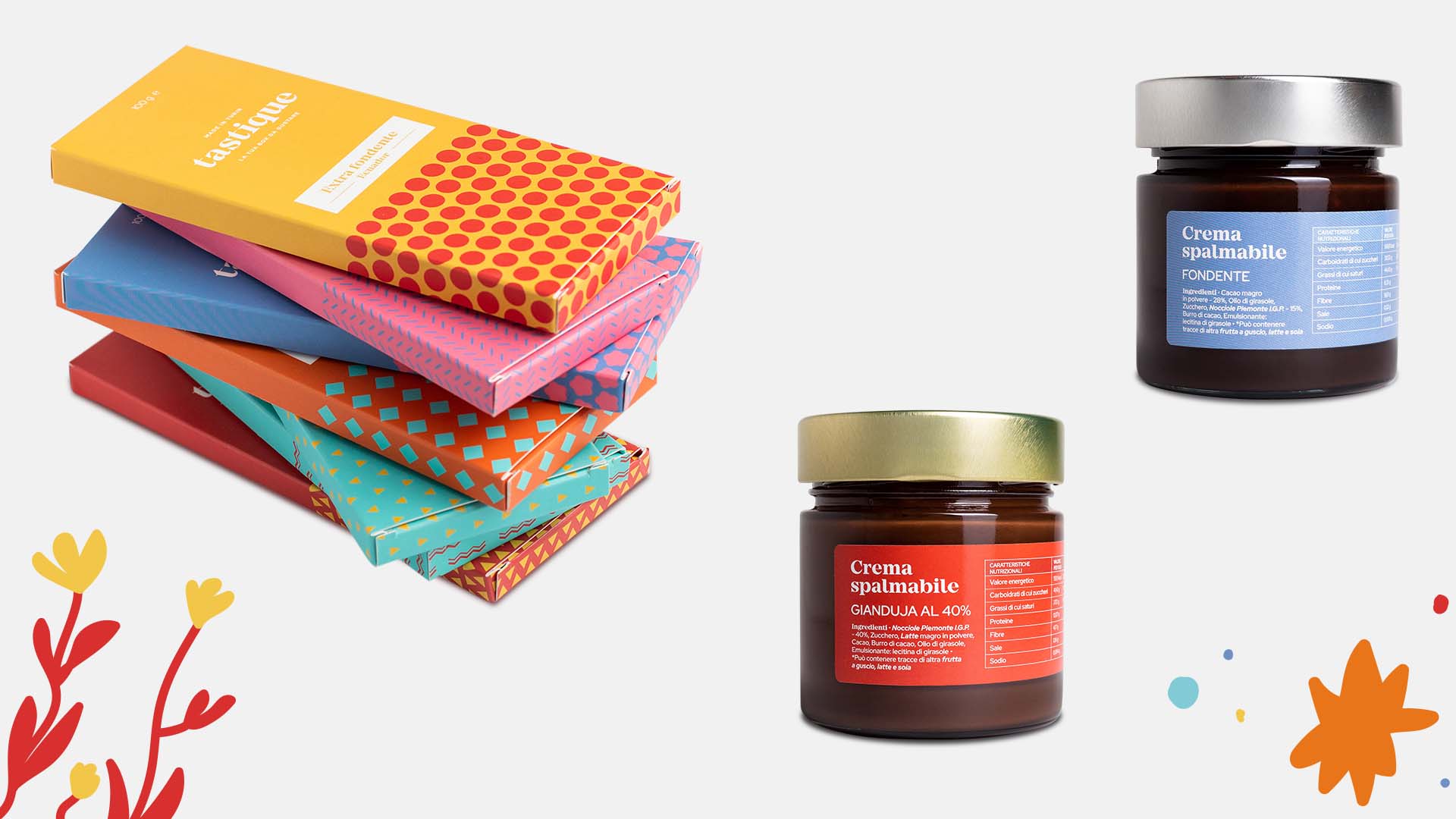
A young and colorfull packaging for Tastique!
Piedmont tradition and vivid illustrations are the key of Tastique brand new identity, a project created by Quattrolinee for the historical company Cappuccetto to introduce chocolate made in Turin in their production.
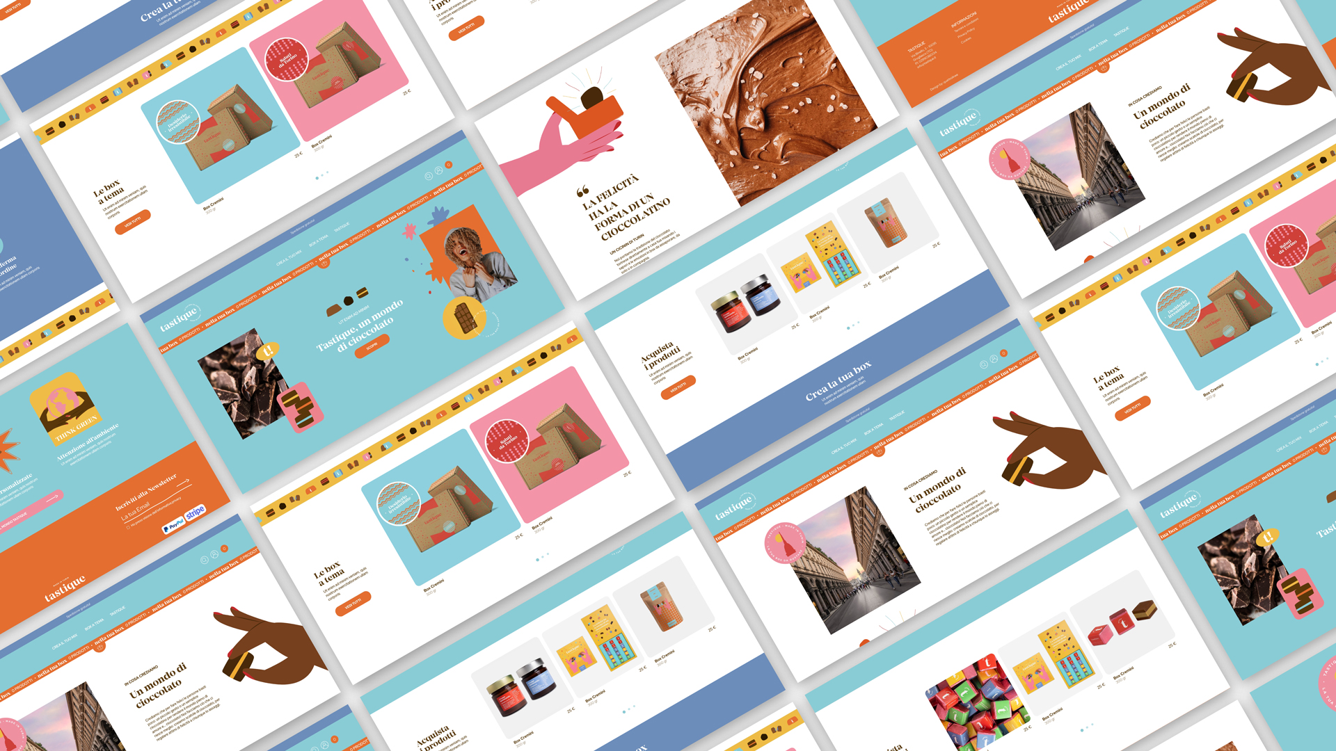
For Tastique we have created a colorful and fun visual identity, full of illustrations designed specifically for the brand. For the web strategy we made a shooting and we developed the website with the support of Instagram sponsorship campaigns to increase public interest in the new product.

Visual identity and packaging
Rebel and fun, Tastique visual identity is dedicated to young people who have a particular attention to the environment and those that are looking for a unique product according to their taste.
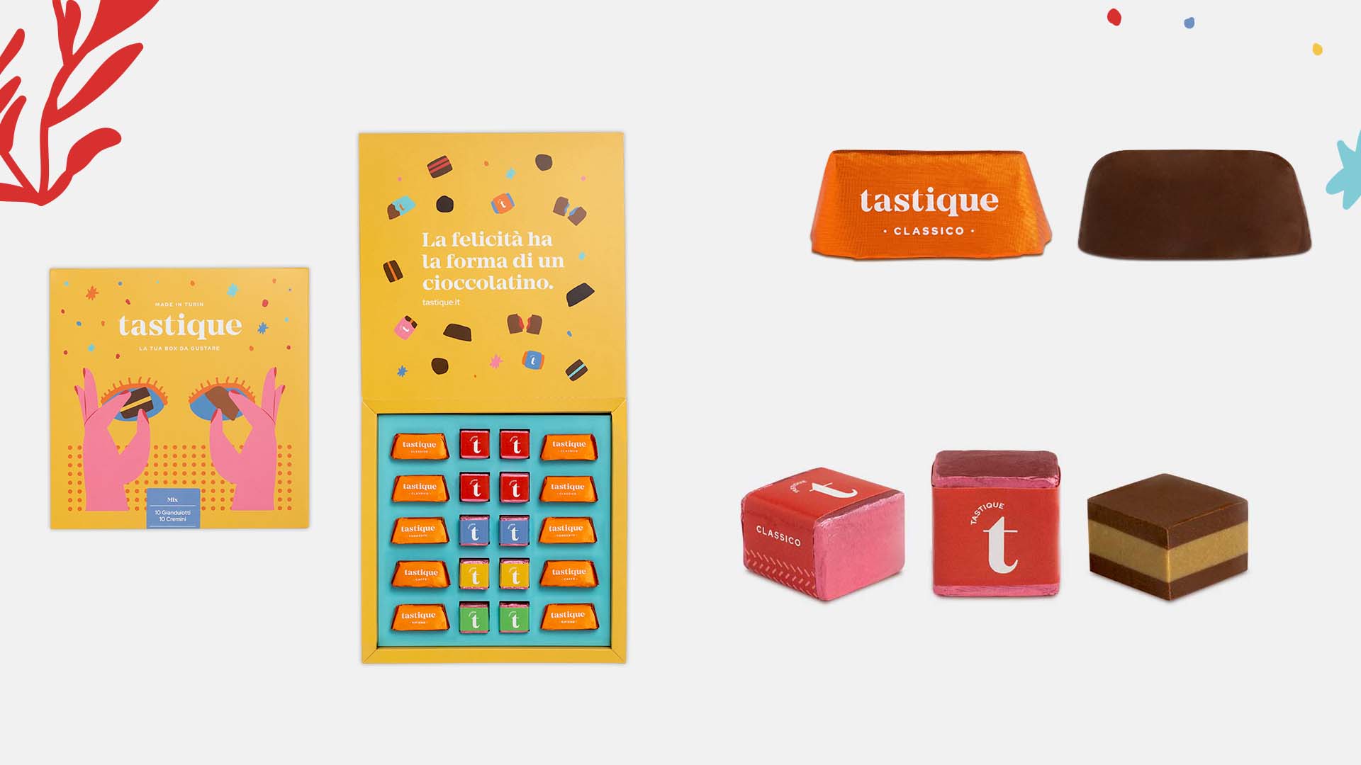
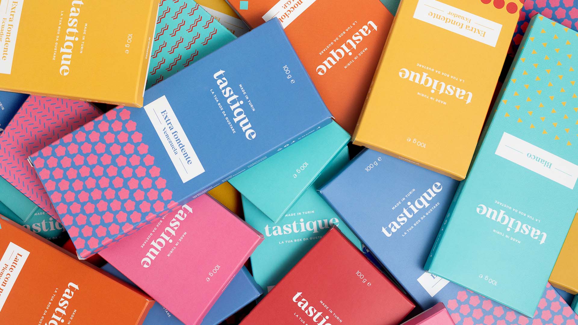
The packaging style is characterized by a lively palette that mixes pastel and vivid colors, such as red and orange. The flat and draw style of illustrations enrichs the visual identity and makes it unique.

A tasty digital strategy
Strategy’s aim is to attract a young and dynamic public that used to shopping online. For this reason, the website has a user-friendly e-commerce to make the navigation pages easier for users and to help them to choose the right product.
The same thing is done on Instagram with the purpose to trigger a different message that focuses on unique and colorful products.